> ## Documentation Index
> Fetch the complete documentation index at: https://docs.reelevant.com/llms.txt
> Use this file to discover all available pages before exploring further.
# Customer Impact
> How Reelevant measures the effect of personalisation on customer value, average order value, purchase frequency, repurchase cycle and retention, by comparing the Exposed Population with a comparable Non-Exposed Population
**Beta** — Customer impact and [Adoption](/advanced-guide/analytics/adoption) are both in beta and enabled on request. Behaviour and available measures may still change, and numbers may be refined as the feature matures.
 ## Before you begin
Attribution answers what a conversion owes to a Reelevant interaction. Customer impact answers a different question: are the customers you personalise for worth more than comparable customers you do not personalise for, and through which behaviour.
These measures require the purchase dataset configured as your attribution source in [Analytics Settings](/product-guide/analytics/settings) to carry a customer identifier. Website purchase events are not enough: a browser only knows who the visitor is once they have identified themselves, so per-customer measures are rejected when your attribution source is web tracking rather than a purchase dataset.
## What is measured
Every measure is computed over the period you query, on the customers Reelevant reached over that period.
| Measure | Definition |
| ---------------------------------------- | ---------------------------------------------------------------------------------------------------------------------- |
| **Value per customer** | Revenue over the period divided by the number of customers. A windowed customer value, not a projected lifetime value. |
| **Average order value** | Revenue over the period divided by the number of orders. |
| **Orders per customer** | Orders over the period divided by the number of customers. |
| **Days between purchases** | Length of the period divided by orders per customer. |
| **Retention rate** | Share of the customers who bought over the preceding period and bought again over the period. |
| **Value per customer before the period** | The same value per customer over the preceding period. A balance check, not a result. |
| **Comparable customers** | Size of the population each figure is computed on. |
Orders are counted as transactions, not as order lines: a basket containing seven product references is one order.
## The comparison
Each measure is available on two populations, the Exposed Population and the Non-Exposed Population, through the **Was Exposed** dimension:
| Population | Definition |
| ------------------------------------- | ------------------------------------------------------------------------------------------------------------------------------------------------------------------------------- |
| **Exposed Population** | Customers whose Reelevant experience was mostly personalised over the period: by default at least two personalised Contents, and at least half of the Contents they were shown. |
| **Comparable Non-Exposed Population** | Customers who were shown Reelevant Contents but never a personalised one, weighted so that their buying behaviour before the period matches the Exposed Population. |
Both populations are drawn from the customers Reelevant reached, so the comparison is personalisation against the same channels without personalisation. Customers who never appear in your Workflow activity over the period belong to neither population, whatever your purchase data says about them.
## Before you begin
Attribution answers what a conversion owes to a Reelevant interaction. Customer impact answers a different question: are the customers you personalise for worth more than comparable customers you do not personalise for, and through which behaviour.
These measures require the purchase dataset configured as your attribution source in [Analytics Settings](/product-guide/analytics/settings) to carry a customer identifier. Website purchase events are not enough: a browser only knows who the visitor is once they have identified themselves, so per-customer measures are rejected when your attribution source is web tracking rather than a purchase dataset.
## What is measured
Every measure is computed over the period you query, on the customers Reelevant reached over that period.
| Measure | Definition |
| ---------------------------------------- | ---------------------------------------------------------------------------------------------------------------------- |
| **Value per customer** | Revenue over the period divided by the number of customers. A windowed customer value, not a projected lifetime value. |
| **Average order value** | Revenue over the period divided by the number of orders. |
| **Orders per customer** | Orders over the period divided by the number of customers. |
| **Days between purchases** | Length of the period divided by orders per customer. |
| **Retention rate** | Share of the customers who bought over the preceding period and bought again over the period. |
| **Value per customer before the period** | The same value per customer over the preceding period. A balance check, not a result. |
| **Comparable customers** | Size of the population each figure is computed on. |
Orders are counted as transactions, not as order lines: a basket containing seven product references is one order.
## The comparison
Each measure is available on two populations, the Exposed Population and the Non-Exposed Population, through the **Was Exposed** dimension:
| Population | Definition |
| ------------------------------------- | ------------------------------------------------------------------------------------------------------------------------------------------------------------------------------- |
| **Exposed Population** | Customers whose Reelevant experience was mostly personalised over the period: by default at least two personalised Contents, and at least half of the Contents they were shown. |
| **Comparable Non-Exposed Population** | Customers who were shown Reelevant Contents but never a personalised one, weighted so that their buying behaviour before the period matches the Exposed Population. |
Both populations are drawn from the customers Reelevant reached, so the comparison is personalisation against the same channels without personalisation. Customers who never appear in your Workflow activity over the period belong to neither population, whatever your purchase data says about them.
 Customers whose experience was only partly personalised — one personalised Content among many non-personalised ones — belong to neither population. They remain visible in the population counts, but they weigh on no comparison: counting them as exposed would describe an experience they did not have.
Both thresholds are part of your reporting configuration, under **Personalization exposure** in [Analytics Settings](/product-guide/analytics/settings). Raise them when personalisation is the norm across your Workflows, lower them when only a few Contents are personalised.
Customers whose experience was only partly personalised — one personalised Content among many non-personalised ones — belong to neither population. They remain visible in the population counts, but they weigh on no comparison: counting them as exposed would describe an experience they did not have.
Both thresholds are part of your reporting configuration, under **Personalization exposure** in [Analytics Settings](/product-guide/analytics/settings). Raise them when personalisation is the norm across your Workflows, lower them when only a few Contents are personalised.
 | Setting | Default | Effect |
| --------------------------------- | ------- | ----------------------------------------------------------------------------------------------------- |
| **Minimum personalised displays** | 2 | Personalised Contents a customer must have been shown over the exposure window to qualify as exposed. |
| **Minimum personalised share** | 50% | Share of the Contents shown to a customer that must be personalised. |
Left empty, each threshold falls back to its default. Changing either one redraws both populations, so the measures move: expect a stricter threshold to shrink the Exposed Population and to widen the differences.
The weighting matters. Customers who receive more personalisation tend to be more engaged, so they tend to be better customers before any personalisation happens. Reelevant therefore groups customers by decile of orders and decile of value over the preceding period, and weights the Non-Exposed Population so that each decile carries the same share as in the Exposed Population. The two populations then have, on average, the same purchasing history.
## The uplift measures
| Measure | Definition |
| ------------------------------ | ---------------------------------------------------------------------------------------------------------------------- |
| **Customer Value Uplift** | Growth of value per customer on the Exposed Population, divided by the same growth on the Non-Exposed Population. |
| **Average Order Value Uplift** | The same ratio of growths, on average order value. |
| **Purchase Frequency Uplift** | The same ratio of growths, on orders per customer. |
| **Repurchase Cycle Gain** | The purchase frequency uplift restated in days. Positive means customers come back sooner. |
| **Retention Uplift** | Retention rate of the Exposed Population minus the retention rate of the Non-Exposed Population, in percentage points. |
| **Cohort Pre-Period Gap** | Difference in value per customer between the two populations *before* the period. |
Each uplift compares each population with **its own** preceding period, rather than comparing the two populations directly. Two effects then cancel out: a seasonal trend that affects everyone, and whatever difference the weighting could not close.
Cohort Pre-Period Gap is how you check the comparison rather than a result to report. On one retailer, weighting brings it below 1%, which is what makes the uplifts meaningful. A gap of more than a few percent means the two populations are not comparable enough and the uplifts should be read as indicative only.
### Worked example
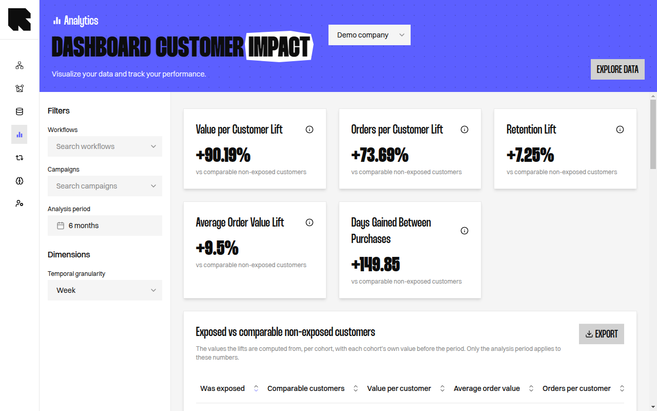
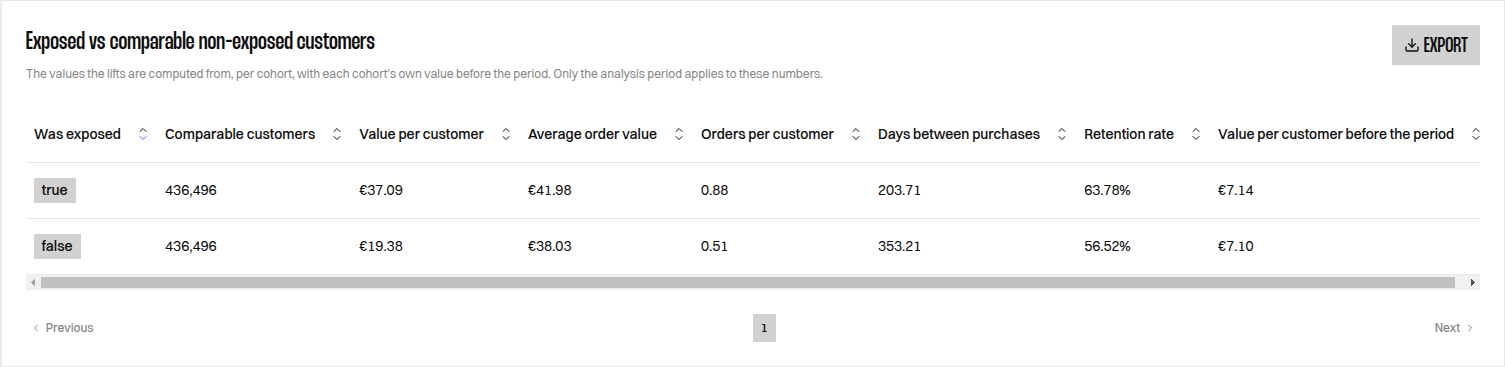
One retailer, six months, 436,496 comparable customers on each side:
| Measure | Exposed | Non-Exposed | Uplift |
| ------------------------------------ | ------- | ----------- | ----------------- |
| Value per customer | 37.09 | 19.38 | +90.2% |
| Average order value | 41.98 | 38.03 | +9.5% |
| Orders per customer | 0.88 | 0.51 | +73.7% |
| Retention rate | 63.8% | 56.5% | +7.3pt |
| Days between purchases | 203.7 | 353.2 | 149.9 days sooner |
| Value per customer before the period | 7.14 | 7.10 | 0.6% gap |
Read the mechanism, not only the headline. Value per customer is up 90.2%, and most of it comes from customers ordering more often rather than spending more per order, which moves 9.5%. Retention is 7.3 points higher, so the gain is partly in holding on to established buyers and partly in how many of the reached customers buy at all. The pre-period gap of 0.6% is what makes the comparison usable.
## Where the difference came from
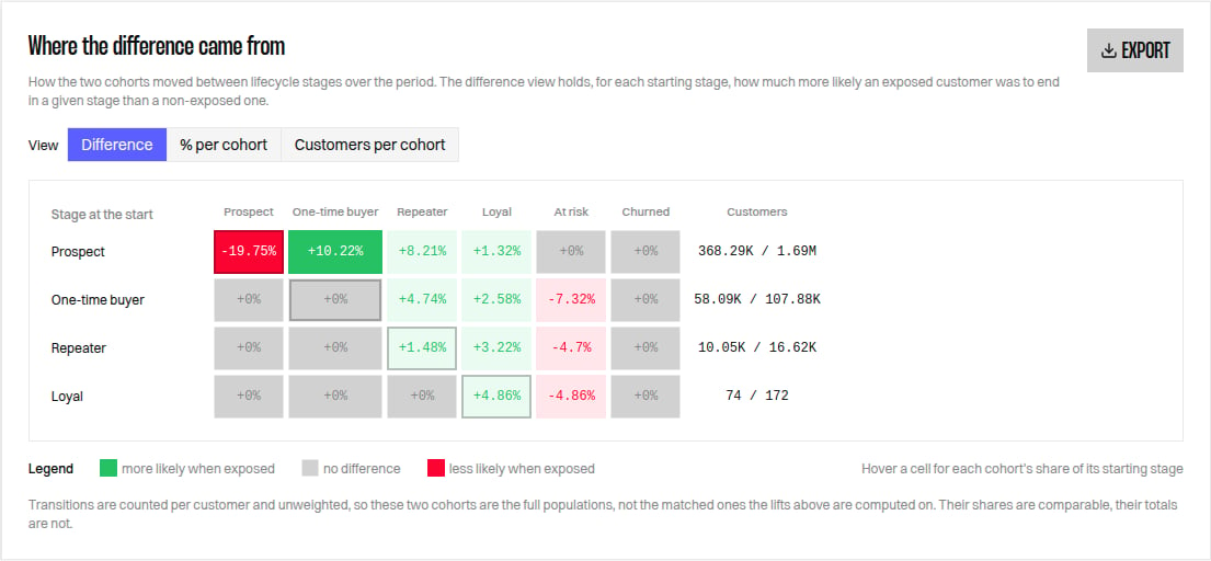
The Uplift measures say how much the two populations differ. The lifecycle matrix says where that difference sits, by following each customer from their lifecycle stage at the start of the period to their stage at the end.
| Setting | Default | Effect |
| --------------------------------- | ------- | ----------------------------------------------------------------------------------------------------- |
| **Minimum personalised displays** | 2 | Personalised Contents a customer must have been shown over the exposure window to qualify as exposed. |
| **Minimum personalised share** | 50% | Share of the Contents shown to a customer that must be personalised. |
Left empty, each threshold falls back to its default. Changing either one redraws both populations, so the measures move: expect a stricter threshold to shrink the Exposed Population and to widen the differences.
The weighting matters. Customers who receive more personalisation tend to be more engaged, so they tend to be better customers before any personalisation happens. Reelevant therefore groups customers by decile of orders and decile of value over the preceding period, and weights the Non-Exposed Population so that each decile carries the same share as in the Exposed Population. The two populations then have, on average, the same purchasing history.
## The uplift measures
| Measure | Definition |
| ------------------------------ | ---------------------------------------------------------------------------------------------------------------------- |
| **Customer Value Uplift** | Growth of value per customer on the Exposed Population, divided by the same growth on the Non-Exposed Population. |
| **Average Order Value Uplift** | The same ratio of growths, on average order value. |
| **Purchase Frequency Uplift** | The same ratio of growths, on orders per customer. |
| **Repurchase Cycle Gain** | The purchase frequency uplift restated in days. Positive means customers come back sooner. |
| **Retention Uplift** | Retention rate of the Exposed Population minus the retention rate of the Non-Exposed Population, in percentage points. |
| **Cohort Pre-Period Gap** | Difference in value per customer between the two populations *before* the period. |
Each uplift compares each population with **its own** preceding period, rather than comparing the two populations directly. Two effects then cancel out: a seasonal trend that affects everyone, and whatever difference the weighting could not close.
Cohort Pre-Period Gap is how you check the comparison rather than a result to report. On one retailer, weighting brings it below 1%, which is what makes the uplifts meaningful. A gap of more than a few percent means the two populations are not comparable enough and the uplifts should be read as indicative only.
### Worked example
One retailer, six months, 436,496 comparable customers on each side:
| Measure | Exposed | Non-Exposed | Uplift |
| ------------------------------------ | ------- | ----------- | ----------------- |
| Value per customer | 37.09 | 19.38 | +90.2% |
| Average order value | 41.98 | 38.03 | +9.5% |
| Orders per customer | 0.88 | 0.51 | +73.7% |
| Retention rate | 63.8% | 56.5% | +7.3pt |
| Days between purchases | 203.7 | 353.2 | 149.9 days sooner |
| Value per customer before the period | 7.14 | 7.10 | 0.6% gap |
Read the mechanism, not only the headline. Value per customer is up 90.2%, and most of it comes from customers ordering more often rather than spending more per order, which moves 9.5%. Retention is 7.3 points higher, so the gain is partly in holding on to established buyers and partly in how many of the reached customers buy at all. The pre-period gap of 0.6% is what makes the comparison usable.
## Where the difference came from
The Uplift measures say how much the two populations differ. The lifecycle matrix says where that difference sits, by following each customer from their lifecycle stage at the start of the period to their stage at the end.
 | View | What each cell holds |
| ------------------------ | ------------------------------------------------------------------------------------------------------------------------------- |
| **Difference** (default) | Share of the Exposed Population ending in that stage, minus the same share of the Non-Exposed Population, in percentage points. |
| **% per cohort** | Share of the starting stage ending in that stage, per population. Rows add up to 100%. |
| **Customers per cohort** | Number of customers, per population. |
Read the difference view row by row. In the example above, 19.8 points fewer exposed customers stayed prospects, and those customers reappear as first purchases and repeat purchases, which is the mechanism behind the value and frequency measures.
The matrix is unweighted, so its two populations are the full ones rather than the matched populations behind the measures above. Shares are comparable between the two, totals are not. Partly personalised customers appear in neither.
Each view exports to CSV, with the view in the file name, so a percentage export cannot be mistaken for a count export.
## Exposure pressure
**Exposure Decile** splits the Exposed Population into ten groups, from the least to the most exposed, so you can read value per customer and orders per customer against exposure volume. It answers whether more exposure keeps paying, and where returns flatten.
Each decile also reports what it was shown — personalised Contents, openings, clicks, and the number of distinct Contents seen — so the deciles read as volumes received rather than as ranks.
| View | What each cell holds |
| ------------------------ | ------------------------------------------------------------------------------------------------------------------------------- |
| **Difference** (default) | Share of the Exposed Population ending in that stage, minus the same share of the Non-Exposed Population, in percentage points. |
| **% per cohort** | Share of the starting stage ending in that stage, per population. Rows add up to 100%. |
| **Customers per cohort** | Number of customers, per population. |
Read the difference view row by row. In the example above, 19.8 points fewer exposed customers stayed prospects, and those customers reappear as first purchases and repeat purchases, which is the mechanism behind the value and frequency measures.
The matrix is unweighted, so its two populations are the full ones rather than the matched populations behind the measures above. Shares are comparable between the two, totals are not. Partly personalised customers appear in neither.
Each view exports to CSV, with the view in the file name, so a percentage export cannot be mistaken for a count export.
## Exposure pressure
**Exposure Decile** splits the Exposed Population into ten groups, from the least to the most exposed, so you can read value per customer and orders per customer against exposure volume. It answers whether more exposure keeps paying, and where returns flatten.
Each decile also reports what it was shown — personalised Contents, openings, clicks, and the number of distinct Contents seen — so the deciles read as volumes received rather than as ranks.
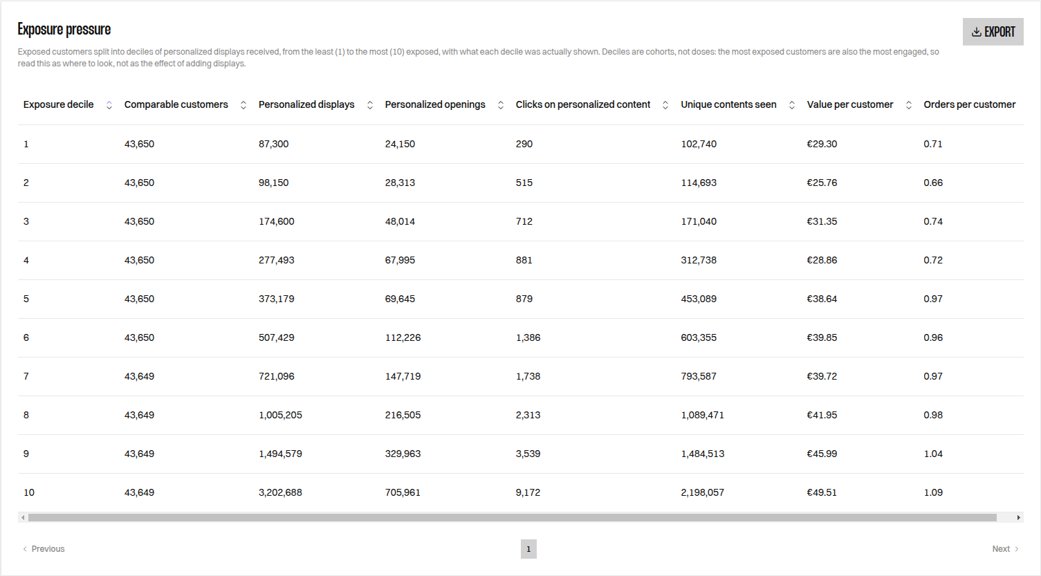 Read the pressure curve within the Exposed Population only. It is a dose-response reading and not a second comparison between the two populations: the most exposed customers are also the most active ones, and part of the curve reflects that rather than the effect of exposure.
## How far these numbers go
Exposure is not randomised. Weighting makes the two populations comparable on their purchasing history, but not on reachability, consent or engagement, and those differences are not observable in the data.
| The result is | The result is not |
| ------------------------------------------------------------------------------- | -------------------------------------------------------------------- |
| A difference measured between two comparable populations over the same period | Proof that personalisation caused the difference |
| Robust to seasonality, since both populations are measured over the same period | A randomised experiment |
| Restricted to the customers Reelevant reached | A measure of what personalisation does to customers you cannot reach |
Report it as the Exposed Population compared with a comparable Non-Exposed Population. A causal claim requires a randomised Non-Exposed Population, where a share of your reachable customers is deliberately never personalised.
Always read Comparable customers before reading any figure. Weighting only keeps customers whose buying history exists on both sides, so a small or very homogeneous population can leave nothing to compare — every measure then reads 0, which is not the same answer as "no effect".
Both populations include customers who had never bought before the period, so a first purchase counts towards the uplifts. Value per customer before the period is then low on both sides, which makes it a balance check between the two populations rather than a figure to report.
Read the pressure curve within the Exposed Population only. It is a dose-response reading and not a second comparison between the two populations: the most exposed customers are also the most active ones, and part of the curve reflects that rather than the effect of exposure.
## How far these numbers go
Exposure is not randomised. Weighting makes the two populations comparable on their purchasing history, but not on reachability, consent or engagement, and those differences are not observable in the data.
| The result is | The result is not |
| ------------------------------------------------------------------------------- | -------------------------------------------------------------------- |
| A difference measured between two comparable populations over the same period | Proof that personalisation caused the difference |
| Robust to seasonality, since both populations are measured over the same period | A randomised experiment |
| Restricted to the customers Reelevant reached | A measure of what personalisation does to customers you cannot reach |
Report it as the Exposed Population compared with a comparable Non-Exposed Population. A causal claim requires a randomised Non-Exposed Population, where a share of your reachable customers is deliberately never personalised.
Always read Comparable customers before reading any figure. Weighting only keeps customers whose buying history exists on both sides, so a small or very homogeneous population can leave nothing to compare — every measure then reads 0, which is not the same answer as "no effect".
Both populations include customers who had never bought before the period, so a first purchase counts towards the uplifts. Value per customer before the period is then low on both sides, which makes it a balance check between the two populations rather than a figure to report.