> ## Documentation Index
> Fetch the complete documentation index at: https://docs.reelevant.com/llms.txt
> Use this file to discover all available pages before exploring further.
# Overview
> Explore all component types available in the Content Editor
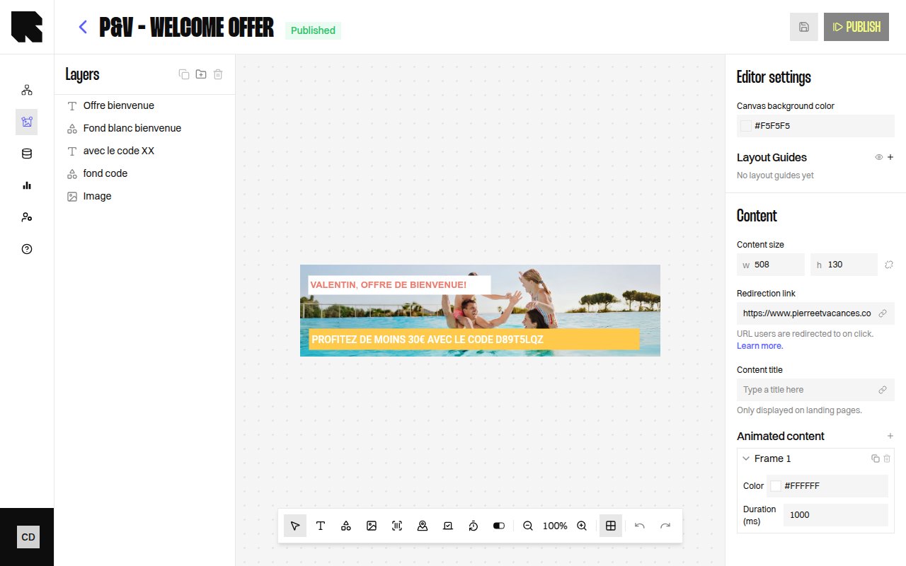 ## Component Types
Components are the building blocks of your content templates. Each component type serves a specific purpose and has its own configuration options.
Rich text with styling, dynamic variables, and transformations.
Static or data-bound images from URLs or datasources.
Rectangle, Circle, and Triangle with fill, stroke, and border radius.
Code128 and EAN barcodes with configurable values.
Animated countdown timers to a target date.
Google Maps with configurable markers, zoom, and style.
Visual progress indicators with current/max values.
## Shared Configuration
All components share these common configuration properties:
| Property | Description |
| -------------------- | -------------------------------------------------------------------------------------------- |
| **Layout** | X position, Y position, Width, Height of the component on the canvas. |
| **Size** | Width and height with an optional **Keep aspect ratio** toggle. |
| **Rotation** | Rotation angle in degrees. |
| **Appearance** | Background color, opacity, and other visual properties. |
| **Redirection link** | A URL that users navigate to when clicking the component. Can be static or data-bound. |
| **Conditions** | Visibility rules based on data values. See [Conditions](/product-guide/contents/conditions). |
Every component property that accepts a value can also accept a **variable** from a connected [datasource](/product-guide/contents/data-binding). Click the variable picker icon next to a field to bind it to dynamic data.
## Component Types
Components are the building blocks of your content templates. Each component type serves a specific purpose and has its own configuration options.
Rich text with styling, dynamic variables, and transformations.
Static or data-bound images from URLs or datasources.
Rectangle, Circle, and Triangle with fill, stroke, and border radius.
Code128 and EAN barcodes with configurable values.
Animated countdown timers to a target date.
Google Maps with configurable markers, zoom, and style.
Visual progress indicators with current/max values.
## Shared Configuration
All components share these common configuration properties:
| Property | Description |
| -------------------- | -------------------------------------------------------------------------------------------- |
| **Layout** | X position, Y position, Width, Height of the component on the canvas. |
| **Size** | Width and height with an optional **Keep aspect ratio** toggle. |
| **Rotation** | Rotation angle in degrees. |
| **Appearance** | Background color, opacity, and other visual properties. |
| **Redirection link** | A URL that users navigate to when clicking the component. Can be static or data-bound. |
| **Conditions** | Visibility rules based on data values. See [Conditions](/product-guide/contents/conditions). |
Every component property that accepts a value can also accept a **variable** from a connected [datasource](/product-guide/contents/data-binding). Click the variable picker icon next to a field to bind it to dynamic data.