> ## Documentation Index
> Fetch the complete documentation index at: https://docs.reelevant.com/llms.txt
> Use this file to discover all available pages before exploring further.
# Image Composition Component
> Combine several product images into one visual, with automatic background removal
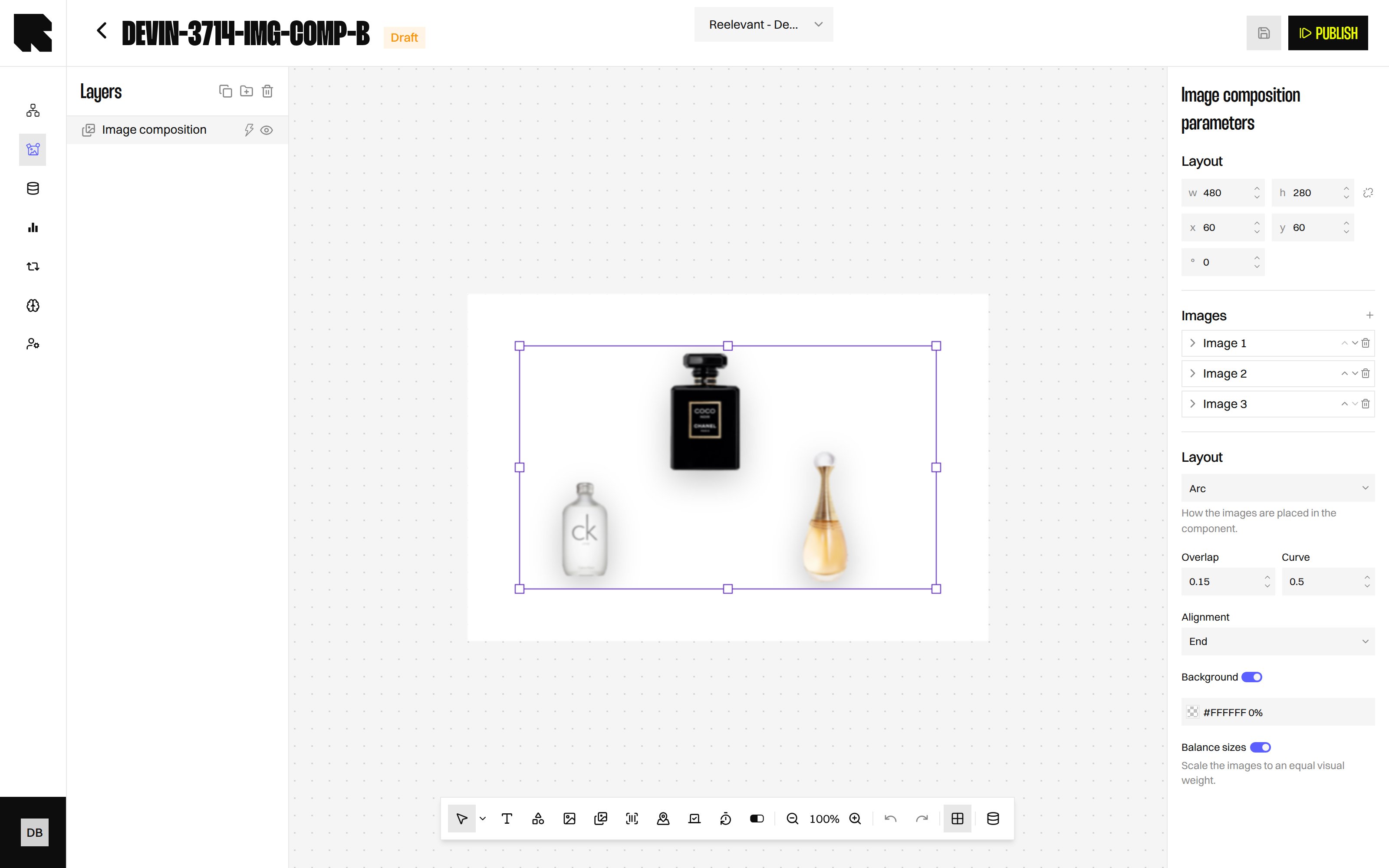
The Image Composition component builds a single visual from several images, arranged automatically and personalised per recipient.
**Beta** — Image Composition is in beta and only available to technical administrators. Its options can still change. Ask your Technical Account Manager if you cannot see it in the toolbar.
 ## Overview
A classic [Image component](/product-guide/contents/components/image) shows one picture. Image Composition takes a list of images and assembles them into one visual for you.
Each image can come from an upload, a URL, or a [Datasource](/product-guide/contents/data-binding) variable. That means the composition changes per recipient, for example the three products someone browsed.
| Property | Value |
| ------------------------- | ----------------------------------- |
| **Toolbar button** | Image composition |
| **Supports data binding** | Yes — every image, one by one |
| **Supports conditions** | Yes |
| **Availability** | Beta, technical administrators only |
Use it for cross-sell visuals, abandoned basket reminders, or a "your selection" banner. You choose how many images the visual holds, and each one follows its own Datasource variable.
## Adding Images
## Overview
A classic [Image component](/product-guide/contents/components/image) shows one picture. Image Composition takes a list of images and assembles them into one visual for you.
Each image can come from an upload, a URL, or a [Datasource](/product-guide/contents/data-binding) variable. That means the composition changes per recipient, for example the three products someone browsed.
| Property | Value |
| ------------------------- | ----------------------------------- |
| **Toolbar button** | Image composition |
| **Supports data binding** | Yes — every image, one by one |
| **Supports conditions** | Yes |
| **Availability** | Beta, technical administrators only |
Use it for cross-sell visuals, abandoned basket reminders, or a "your selection" banner. You choose how many images the visual holds, and each one follows its own Datasource variable.
## Adding Images
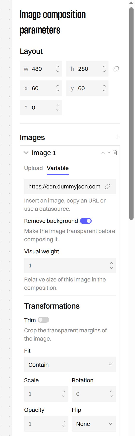 In the [Content Editor](/product-guide/contents/editor), choose **Image composition** in the toolbar, then draw it on the canvas.
In the **Images** section of the configuration panel, use **Add an image** for each image you want.
Open an image and set its source: upload a file, paste a URL, or pick a Datasource variable holding an image address.
Use **Move image backward** and **Move image forward** to control which image overlaps which.
Deleting an image from the list removes its settings too, including its transformations. There is no undo inside the panel.
## Removing the Background
**Remove background** makes an image transparent before it is composed. It is the option that turns ordinary catalogue packshots into products that sit naturally side by side.
The platform does this for you, keeps the result, and reuses it the next time the same image is composed. Packaging, labels, brands and colours are preserved — only the background is removed.
It works best on catalogue packshots shot on a plain background. Lifestyle photos with a busy background give less predictable results.
## Transforming Each Image
Each image has its own **Transformations** and **Adjustments**, so you can make a small product stand out next to a large one.
| Option | What it does |
| ----------------- | -------------------------------------------------------- |
| **Trim** | Crops the transparent margins around the image. |
| **Fit** | Contain, Cover or Stretch the image inside its space. |
| **Scale** | Makes the image bigger or smaller. |
| **Rotation** | Turns the image. |
| **Opacity** | Makes the image more or less transparent. |
| **Flip** | Mirrors the image horizontally, vertically or both. |
| **Shadow** | Drops a shadow following the shape of the image. |
| **Visual weight** | Sets the relative size of this image in the composition. |
Adjustments cover **Brightness**, **Contrast**, **Saturation**, **Grayscale**, **Blur** and **Tint**, so images from different catalogues can be harmonised.
## Choosing a Layout
In the [Content Editor](/product-guide/contents/editor), choose **Image composition** in the toolbar, then draw it on the canvas.
In the **Images** section of the configuration panel, use **Add an image** for each image you want.
Open an image and set its source: upload a file, paste a URL, or pick a Datasource variable holding an image address.
Use **Move image backward** and **Move image forward** to control which image overlaps which.
Deleting an image from the list removes its settings too, including its transformations. There is no undo inside the panel.
## Removing the Background
**Remove background** makes an image transparent before it is composed. It is the option that turns ordinary catalogue packshots into products that sit naturally side by side.
The platform does this for you, keeps the result, and reuses it the next time the same image is composed. Packaging, labels, brands and colours are preserved — only the background is removed.
It works best on catalogue packshots shot on a plain background. Lifestyle photos with a busy background give less predictable results.
## Transforming Each Image
Each image has its own **Transformations** and **Adjustments**, so you can make a small product stand out next to a large one.
| Option | What it does |
| ----------------- | -------------------------------------------------------- |
| **Trim** | Crops the transparent margins around the image. |
| **Fit** | Contain, Cover or Stretch the image inside its space. |
| **Scale** | Makes the image bigger or smaller. |
| **Rotation** | Turns the image. |
| **Opacity** | Makes the image more or less transparent. |
| **Flip** | Mirrors the image horizontally, vertically or both. |
| **Shadow** | Drops a shadow following the shape of the image. |
| **Visual weight** | Sets the relative size of this image in the composition. |
Adjustments cover **Brightness**, **Contrast**, **Saturation**, **Grayscale**, **Blur** and **Tint**, so images from different catalogues can be harmonised.
## Choosing a Layout
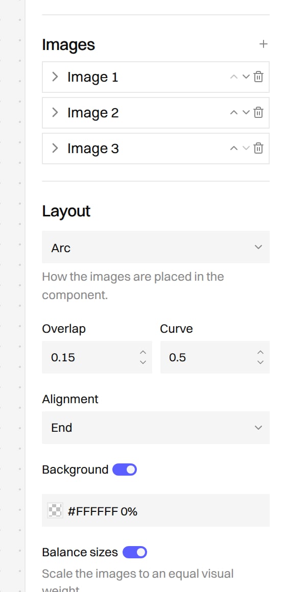 The layout decides how the images are placed inside the component.
| Layout | Best for | Options |
| -------- | -------------------------------------------------------- | --------------------------- |
| **Arc** | Product groups with a natural, slightly overlapping look | Overlap, Curve, Alignment |
| **Row** | A simple line of products | Gap, Alignment |
| **Grid** | Several products in even rows | Columns, Gap |
| **Free** | Full control over each position | Position and size per image |
Two switches finish the composition:
* **Background** adds a colour behind the images, useful once backgrounds are removed.
* **Balance sizes** scales the images to an equal visual weight, so a small bottle is not dwarfed by a large box.
## Previewing the Result
The composition is built for you and shown directly on the canvas, so you see the final visual while you edit. Changing a layout, a colour or a transformation repaints the preview.
The canvas shows the real composition, backgrounds removed included, so what you see is what your recipients get.
## What's Next?
Add a single static or data-bound image.
Feed each image from a Datasource variable.
Show the composition only to the right audience.
Explore the other component types.
The layout decides how the images are placed inside the component.
| Layout | Best for | Options |
| -------- | -------------------------------------------------------- | --------------------------- |
| **Arc** | Product groups with a natural, slightly overlapping look | Overlap, Curve, Alignment |
| **Row** | A simple line of products | Gap, Alignment |
| **Grid** | Several products in even rows | Columns, Gap |
| **Free** | Full control over each position | Position and size per image |
Two switches finish the composition:
* **Background** adds a colour behind the images, useful once backgrounds are removed.
* **Balance sizes** scales the images to an equal visual weight, so a small bottle is not dwarfed by a large box.
## Previewing the Result
The composition is built for you and shown directly on the canvas, so you see the final visual while you edit. Changing a layout, a colour or a transformation repaints the preview.
The canvas shows the real composition, backgrounds removed included, so what you see is what your recipients get.
## What's Next?
Add a single static or data-bound image.
Feed each image from a Datasource variable.
Show the composition only to the right audience.
Explore the other component types.