> ## Documentation Index
> Fetch the complete documentation index at: https://docs.reelevant.com/llms.txt
> Use this file to discover all available pages before exploring further.
# Conditions
> Control component visibility with data-driven rules based on datasource values
 ## Overview
Conditions let you show or hide components based on data values at render time. Use conditions to create personalized templates that adapt to each user's context — for example, showing a different image based on a product category or hiding a section when a field is empty.
## How Conditions Work
A condition is attached to a component or [group](/product-guide/contents/layers) in the layers tree. When the content is rendered:
1. The platform evaluates each condition against the resolved data.
2. If a condition is **met**, the component is displayed in that condition's state.
3. If **no condition is met**, the **default state** is shown.
## Condition Groups
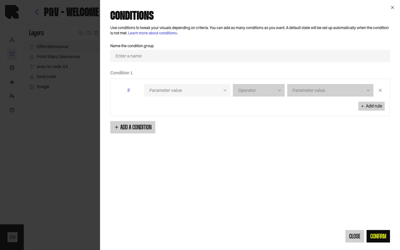
A condition group is a named container for one or more condition rules on a component. Each rule defines a data-driven test (e.g., "product category equals Shoes").
| Property | Description |
| ------------------- | ----------------------------------------------------------------------------------------- |
| **Name** | A descriptive name for the condition group. |
| **Condition rules** | One or more data tests. Each condition creates a separate visual state for the component. |
| **Default state** | The fallback state shown when no condition is met. |
## Creating Conditions
Click the component in the [layers tree](/product-guide/contents/layers) or on the canvas.
In the layers tree, right-click the component and select **Add condition**, or use the condition action in the configuration panel.
Define the data test by selecting a [datasource](/product-guide/contents/data-binding) variable and a comparison operator.
Switch between condition states using the dropdown in the layers tree. Customize the component's appearance for each state.
## Display None Option
You can toggle **Display none if condition is false** to completely hide the component when no condition is met, instead of showing a default state.
Apply conditions to [groups](/product-guide/contents/layers) to control the visibility of multiple components at once.
## Previewing Conditions
Use the condition state dropdown in the layers tree to preview each condition state on the canvas. The dropdown shows:
* **Condition 1**, **Condition 2**, etc. — each named condition state.
* **default** — the fallback state.
## Overview
Conditions let you show or hide components based on data values at render time. Use conditions to create personalized templates that adapt to each user's context — for example, showing a different image based on a product category or hiding a section when a field is empty.
## How Conditions Work
A condition is attached to a component or [group](/product-guide/contents/layers) in the layers tree. When the content is rendered:
1. The platform evaluates each condition against the resolved data.
2. If a condition is **met**, the component is displayed in that condition's state.
3. If **no condition is met**, the **default state** is shown.
## Condition Groups
A condition group is a named container for one or more condition rules on a component. Each rule defines a data-driven test (e.g., "product category equals Shoes").
| Property | Description |
| ------------------- | ----------------------------------------------------------------------------------------- |
| **Name** | A descriptive name for the condition group. |
| **Condition rules** | One or more data tests. Each condition creates a separate visual state for the component. |
| **Default state** | The fallback state shown when no condition is met. |
## Creating Conditions
Click the component in the [layers tree](/product-guide/contents/layers) or on the canvas.
In the layers tree, right-click the component and select **Add condition**, or use the condition action in the configuration panel.
Define the data test by selecting a [datasource](/product-guide/contents/data-binding) variable and a comparison operator.
Switch between condition states using the dropdown in the layers tree. Customize the component's appearance for each state.
## Display None Option
You can toggle **Display none if condition is false** to completely hide the component when no condition is met, instead of showing a default state.
Apply conditions to [groups](/product-guide/contents/layers) to control the visibility of multiple components at once.
## Previewing Conditions
Use the condition state dropdown in the layers tree to preview each condition state on the canvas. The dropdown shows:
* **Condition 1**, **Condition 2**, etc. — each named condition state.
* **default** — the fallback state.