> ## Documentation Index
> Fetch the complete documentation index at: https://docs.reelevant.com/llms.txt
> Use this file to discover all available pages before exploring further.
# Content Editor
> Navigate and use the visual content editor to design dynamic templates
 ## Editor Layout
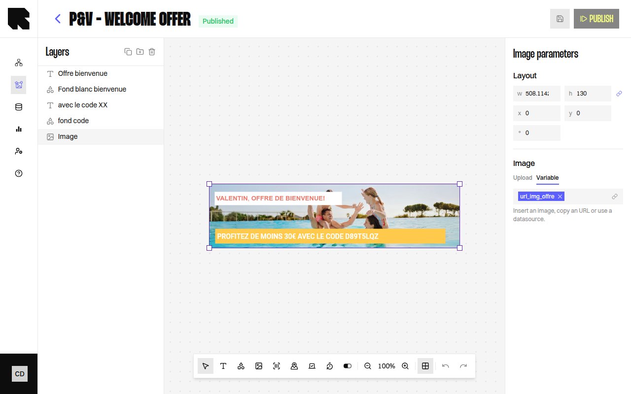
The content editor is a full-screen visual workspace for designing templates. It consists of five main areas:
1. **Header bar** — Displays the content name, status badge, and action buttons (Preview, Publish, Settings).
2. **Canvas** — The central design area where components are rendered. You can pan, zoom, and select components.
3. **Toolbar** — A horizontal bar with tools for adding components, adjusting zoom, undo/redo, and toggling layout guides.
4. **Layers panel** — A tree view on the left showing all components with their hierarchy, grouping, and visibility toggles. See [Layers](/product-guide/contents/layers).
5. **Configuration panel** — Opens on the right when a component is selected, showing its properties. See individual [component pages](/product-guide/contents/components).
6. **Frame dock** — A page preview carousel at the bottom for multi-frame content. See [Frames](/product-guide/contents/frames).
## Toolbar
The toolbar provides quick access to all component types and canvas controls:
### Adding Components
| Tool | Description |
| ------------------ | ----------------------------------------------------------------------------------------------- |
| **Move** (pointer) | Default selection and movement tool. |
| **Text** | Add a [Text](/product-guide/contents/components/text) component to the canvas. |
| **Shapes** | Open the shapes menu — [Rectangle, Circle, Triangle](/product-guide/contents/components/shape). |
| **Images** | Add an [Image](/product-guide/contents/components/image) component. |
| **Barcode** | Add a [Barcode](/product-guide/contents/components/barcode) component. |
| **Map** | Add a [Map](/product-guide/contents/components/map) component. |
| **Countdown** | Add a [Countdown](/product-guide/contents/components/countdown) component. |
| **Progress bars** | Add a [Progress Bar or Progress Arc](/product-guide/contents/components/progress) component. |
### Canvas Controls
| Tool | Description |
| ---------------------- | ------------------------------------ |
| **Zoom out / Zoom in** | Adjust the zoom level of the canvas. |
| **Undo** | Revert the last action. |
| **Redo** | Re-apply the last undone action. |
### Layout Guides
Layout guides are visual alignment aids that overlay the canvas. They are not included in the rendered output.
| Setting | Description |
| ----------------------------- | -------------------------------------- |
| **Show / Hide layout guides** | Toggle guide visibility. |
| **Type** | Grid, Columns, or Rows. |
| **Size** | The spacing of the guide. |
| **Count** | Number of columns or rows. |
| **Color** | Guide overlay color. |
| **Alignment** | Stretch, Left, Center, or Top. |
| **Margin / Gutter** | Outer margin and inner gutter spacing. |
## Editor Settings
When no component is selected, the configuration panel shows the content-level settings:
| Setting | Description |
| --------------------------- | ----------------------------------------------------------------------------------------------- |
| **Content size** | Width and height of the canvas in pixels. |
| **Canvas background color** | The background fill for the design area. |
| **Animated content** | Toggle to enable [frames](/product-guide/contents/frames) for animated or multi-page templates. |
| **Content title** | A title displayed only on landing pages. |
## Keyboard Shortcuts
The content editor supports keyboard shortcuts for common actions:
| Shortcut | Action |
| -------------------------------- | ----------------------------------------------------------------- |
| **Ctrl+C** / **⌘+C** | Copy selected components, groups, or conditions to the clipboard. |
| **Ctrl+V** / **⌘+V** | Paste previously copied elements into the current content. |
| **Ctrl+Z** / **⌘+Z** | Undo the last action. |
| **Ctrl+Shift+Z** / **⌘+Shift+Z** | Redo the last undone action. |
| **Delete** / **Backspace** | Delete the selected components. |
### Copy / Paste
You can copy and paste components, component groups, and condition groups within the same content or across different contents.
**Copying:**
1. Select one or more elements in the [layers panel](/product-guide/contents/layers) or directly on the canvas.
2. Press **Ctrl+C** (or **⌘+C** on Mac).
3. A success notification confirms how many elements were copied.
**Pasting:**
1. Press **Ctrl+V** (or **⌘+V** on Mac) in the target content editor.
2. All copied elements are recreated with new identifiers, including their nested children, data bindings, and datasource dependencies.
3. A success notification confirms how many elements were pasted.
Copy/paste works across different contents within the same account. If a pasted element references a datasource that doesn't exist in the target account, an error notification is shown and the remaining elements are still pasted.
Pasted components keep their original position on the canvas, making it easy to replicate layouts across contents.
## Working with Components
### Adding Components
Click a tool in the toolbar, then click on the canvas to place the component. Alternatively, select a tool and drag on the canvas to define the size.
### Selecting and Moving
Click a component on the canvas or in the [layers tree](/product-guide/contents/layers) to select it. Drag to reposition. Use the resize handles to change dimensions.
### Configuration Panel
When a component is selected, the configuration panel shows:
* **Layout** — X position, Y position, Width, Height.
* **Position** — Coordinates on the canvas.
* **Size** — Dimensions with optional aspect ratio lock.
* **Rotation** — Rotation angle.
* **Appearance** — Component-specific styling (fill, stroke, border radius, etc.).
* **Redirection** — A [redirection link](/product-guide/contents/components/text) URL that users navigate to when clicking the component.
### Publishing
Click **Publish** in the header to validate and publish the content. Once published, the content can be used in [workflow output nodes](/product-guide/workflows/output-nodes/visual-content).
The Publish action validates the content structure. If there are dependency errors (e.g., a referenced [workflow](/product-guide/workflows/overview) is missing a variable), an error modal will list the issues.
## Editor Layout
The content editor is a full-screen visual workspace for designing templates. It consists of five main areas:
1. **Header bar** — Displays the content name, status badge, and action buttons (Preview, Publish, Settings).
2. **Canvas** — The central design area where components are rendered. You can pan, zoom, and select components.
3. **Toolbar** — A horizontal bar with tools for adding components, adjusting zoom, undo/redo, and toggling layout guides.
4. **Layers panel** — A tree view on the left showing all components with their hierarchy, grouping, and visibility toggles. See [Layers](/product-guide/contents/layers).
5. **Configuration panel** — Opens on the right when a component is selected, showing its properties. See individual [component pages](/product-guide/contents/components).
6. **Frame dock** — A page preview carousel at the bottom for multi-frame content. See [Frames](/product-guide/contents/frames).
## Toolbar
The toolbar provides quick access to all component types and canvas controls:
### Adding Components
| Tool | Description |
| ------------------ | ----------------------------------------------------------------------------------------------- |
| **Move** (pointer) | Default selection and movement tool. |
| **Text** | Add a [Text](/product-guide/contents/components/text) component to the canvas. |
| **Shapes** | Open the shapes menu — [Rectangle, Circle, Triangle](/product-guide/contents/components/shape). |
| **Images** | Add an [Image](/product-guide/contents/components/image) component. |
| **Barcode** | Add a [Barcode](/product-guide/contents/components/barcode) component. |
| **Map** | Add a [Map](/product-guide/contents/components/map) component. |
| **Countdown** | Add a [Countdown](/product-guide/contents/components/countdown) component. |
| **Progress bars** | Add a [Progress Bar or Progress Arc](/product-guide/contents/components/progress) component. |
### Canvas Controls
| Tool | Description |
| ---------------------- | ------------------------------------ |
| **Zoom out / Zoom in** | Adjust the zoom level of the canvas. |
| **Undo** | Revert the last action. |
| **Redo** | Re-apply the last undone action. |
### Layout Guides
Layout guides are visual alignment aids that overlay the canvas. They are not included in the rendered output.
| Setting | Description |
| ----------------------------- | -------------------------------------- |
| **Show / Hide layout guides** | Toggle guide visibility. |
| **Type** | Grid, Columns, or Rows. |
| **Size** | The spacing of the guide. |
| **Count** | Number of columns or rows. |
| **Color** | Guide overlay color. |
| **Alignment** | Stretch, Left, Center, or Top. |
| **Margin / Gutter** | Outer margin and inner gutter spacing. |
## Editor Settings
When no component is selected, the configuration panel shows the content-level settings:
| Setting | Description |
| --------------------------- | ----------------------------------------------------------------------------------------------- |
| **Content size** | Width and height of the canvas in pixels. |
| **Canvas background color** | The background fill for the design area. |
| **Animated content** | Toggle to enable [frames](/product-guide/contents/frames) for animated or multi-page templates. |
| **Content title** | A title displayed only on landing pages. |
## Keyboard Shortcuts
The content editor supports keyboard shortcuts for common actions:
| Shortcut | Action |
| -------------------------------- | ----------------------------------------------------------------- |
| **Ctrl+C** / **⌘+C** | Copy selected components, groups, or conditions to the clipboard. |
| **Ctrl+V** / **⌘+V** | Paste previously copied elements into the current content. |
| **Ctrl+Z** / **⌘+Z** | Undo the last action. |
| **Ctrl+Shift+Z** / **⌘+Shift+Z** | Redo the last undone action. |
| **Delete** / **Backspace** | Delete the selected components. |
### Copy / Paste
You can copy and paste components, component groups, and condition groups within the same content or across different contents.
**Copying:**
1. Select one or more elements in the [layers panel](/product-guide/contents/layers) or directly on the canvas.
2. Press **Ctrl+C** (or **⌘+C** on Mac).
3. A success notification confirms how many elements were copied.
**Pasting:**
1. Press **Ctrl+V** (or **⌘+V** on Mac) in the target content editor.
2. All copied elements are recreated with new identifiers, including their nested children, data bindings, and datasource dependencies.
3. A success notification confirms how many elements were pasted.
Copy/paste works across different contents within the same account. If a pasted element references a datasource that doesn't exist in the target account, an error notification is shown and the remaining elements are still pasted.
Pasted components keep their original position on the canvas, making it easy to replicate layouts across contents.
## Working with Components
### Adding Components
Click a tool in the toolbar, then click on the canvas to place the component. Alternatively, select a tool and drag on the canvas to define the size.
### Selecting and Moving
Click a component on the canvas or in the [layers tree](/product-guide/contents/layers) to select it. Drag to reposition. Use the resize handles to change dimensions.
### Configuration Panel
When a component is selected, the configuration panel shows:
* **Layout** — X position, Y position, Width, Height.
* **Position** — Coordinates on the canvas.
* **Size** — Dimensions with optional aspect ratio lock.
* **Rotation** — Rotation angle.
* **Appearance** — Component-specific styling (fill, stroke, border radius, etc.).
* **Redirection** — A [redirection link](/product-guide/contents/components/text) URL that users navigate to when clicking the component.
### Publishing
Click **Publish** in the header to validate and publish the content. Once published, the content can be used in [workflow output nodes](/product-guide/workflows/output-nodes/visual-content).
The Publish action validates the content structure. If there are dependency errors (e.g., a referenced [workflow](/product-guide/workflows/overview) is missing a variable), an error modal will list the issues.