> ## Documentation Index
> Fetch the complete documentation index at: https://docs.reelevant.com/llms.txt
> Use this file to discover all available pages before exploring further.
# Content Editor Overview
> Design dynamic visual templates with a drag-and-drop canvas editor connected to your data
 ## What is the Content Editor?
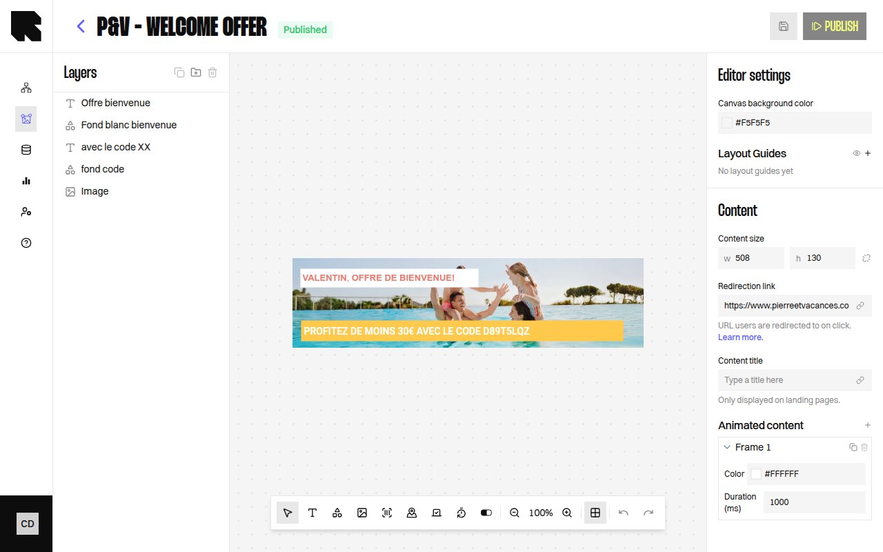
The Content Editor (ContentHub) is the Reelevant platform's visual design tool for building dynamic templates — banners, email sections, landing pages, and more. Using a drag-and-drop canvas, you create layouts with text, images, shapes, and data-driven components, then connect them to [datasources](/product-guide/datahub/overview) to personalize every element at render time.
Each content template is used by [workflow output nodes](/product-guide/workflows/output-nodes/visual-content) to deliver the final visual experience to your audience.
## Key Concepts
| Concept | Description |
| ---------------- | -------------------------------------------------------------------------------------------------------------------------------------------- |
| **Content** | A visual template composed of components arranged on a canvas. |
| **Component** | An individual element on the canvas — Text, Image, Shape, Map, Barcode, Countdown, Progress Bar, or Progress Arc. |
| **Layer** | Every component is a layer in the layers tree. Layers can be reordered, grouped, and toggled for visibility. |
| **Frame** | A page or variant within a content template. Multi-frame content supports animated or multi-page layouts. |
| **Condition** | A visibility rule that shows or hides components based on data values at render time. |
| **Data binding** | Connecting a component property (text, image URL, etc.) to a variable from a [datasource](/product-guide/datahub/overview) or URL parameter. |
| **Dependency** | A data source (datasource, URL parameter, geolocation, weather) attached to the content for dynamic rendering. |
## Content Lifecycle
| Status | Description |
| -------------- | ----------------------------------------------------------------------------------- |
| **Draft** | The content is being edited and has not been published yet. |
| **Publishing** | The content is being validated by the platform. |
| **Published** | The content is ready to be used in a [workflow](/product-guide/workflows/overview). |
| **Error** | The content encountered an issue during publishing. |
A content must be **Published** before it can be assigned to a [visual content output node](/product-guide/workflows/output-nodes/visual-content) in a workflow.
## Editor Layout
The Content Editor is organized into several areas:
1. **Header** — Displays the content name, status, and action buttons (Preview, Publish, Settings).
2. **Canvas** — The main design area where you place and arrange components.
3. **Toolbar** — A bar with tools for adding components (Text, Shapes, Images, Barcode, Map, Countdown, Progress bars), zoom, undo/redo, and layout guides.
4. **Layers panel** — A tree view showing all components and their hierarchy.
5. **Configuration panel** — Opens when a component is selected, showing its properties (position, size, appearance, data binding).
6. **Frame dock** — A page preview carousel at the bottom for navigating between frames.
## What's Next?
Browse, create, and manage your content templates.
Learn the editor layout, toolbar, and canvas controls.
Explore all available component types.
Organize components with the layers tree.
Connect your content to dynamic data sources.
Control component visibility with data-driven rules.
## What is the Content Editor?
The Content Editor (ContentHub) is the Reelevant platform's visual design tool for building dynamic templates — banners, email sections, landing pages, and more. Using a drag-and-drop canvas, you create layouts with text, images, shapes, and data-driven components, then connect them to [datasources](/product-guide/datahub/overview) to personalize every element at render time.
Each content template is used by [workflow output nodes](/product-guide/workflows/output-nodes/visual-content) to deliver the final visual experience to your audience.
## Key Concepts
| Concept | Description |
| ---------------- | -------------------------------------------------------------------------------------------------------------------------------------------- |
| **Content** | A visual template composed of components arranged on a canvas. |
| **Component** | An individual element on the canvas — Text, Image, Shape, Map, Barcode, Countdown, Progress Bar, or Progress Arc. |
| **Layer** | Every component is a layer in the layers tree. Layers can be reordered, grouped, and toggled for visibility. |
| **Frame** | A page or variant within a content template. Multi-frame content supports animated or multi-page layouts. |
| **Condition** | A visibility rule that shows or hides components based on data values at render time. |
| **Data binding** | Connecting a component property (text, image URL, etc.) to a variable from a [datasource](/product-guide/datahub/overview) or URL parameter. |
| **Dependency** | A data source (datasource, URL parameter, geolocation, weather) attached to the content for dynamic rendering. |
## Content Lifecycle
| Status | Description |
| -------------- | ----------------------------------------------------------------------------------- |
| **Draft** | The content is being edited and has not been published yet. |
| **Publishing** | The content is being validated by the platform. |
| **Published** | The content is ready to be used in a [workflow](/product-guide/workflows/overview). |
| **Error** | The content encountered an issue during publishing. |
A content must be **Published** before it can be assigned to a [visual content output node](/product-guide/workflows/output-nodes/visual-content) in a workflow.
## Editor Layout
The Content Editor is organized into several areas:
1. **Header** — Displays the content name, status, and action buttons (Preview, Publish, Settings).
2. **Canvas** — The main design area where you place and arrange components.
3. **Toolbar** — A bar with tools for adding components (Text, Shapes, Images, Barcode, Map, Countdown, Progress bars), zoom, undo/redo, and layout guides.
4. **Layers panel** — A tree view showing all components and their hierarchy.
5. **Configuration panel** — Opens when a component is selected, showing its properties (position, size, appearance, data binding).
6. **Frame dock** — A page preview carousel at the bottom for navigating between frames.
## What's Next?
Browse, create, and manage your content templates.
Learn the editor layout, toolbar, and canvas controls.
Explore all available component types.
Organize components with the layers tree.
Connect your content to dynamic data sources.
Control component visibility with data-driven rules.