Overview
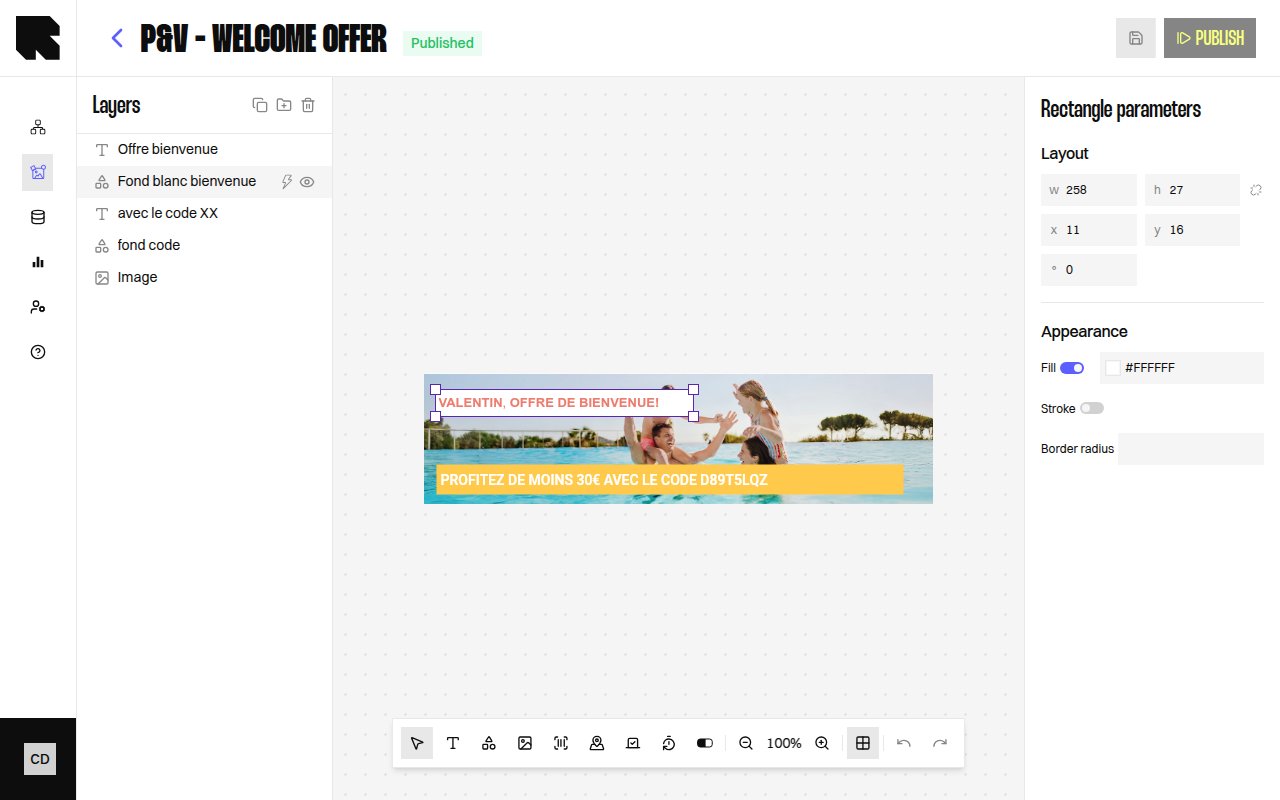
Shape components let you add geometric elements to your content templates. Three shape types are available:| Shape | Description |
|---|---|
| Rectangle | A rectangular shape with configurable border radius. |
| Circle | A circular shape. |
| Triangle | An equilateral triangle. |
Shape Parameters
When a shape is selected, the configuration panel shows properties specific to the shape type:Rectangle Parameters
| Property | Description |
|---|---|
| Fill | Fill color (or No fill for transparent). |
| Stroke | Stroke color and line weight (or No stroke). |
| Border radius | Corner rounding in pixels. |
| Background | Background color (or No background). |
| Line-weight | Stroke width. |
Circle Parameters
| Property | Description |
|---|---|
| Fill | Fill color. |
| Stroke | Stroke color and line weight. |
| Background | Background color. |
Triangle Parameters
| Property | Description |
|---|---|
| Equilateral triangle | The triangle type. |
| Fill | Fill color. |
| Stroke | Stroke color and line weight. |
| Background | Background color. |
Common Properties
All shapes share:| Property | Description |
|---|---|
| Position | X and Y coordinates on the canvas. |
| Size | Width and height with optional Keep aspect ratio toggle. |
| Rotation | Rotation angle in degrees. |
| Redirection link | URL users navigate to when clicking the shape. |