

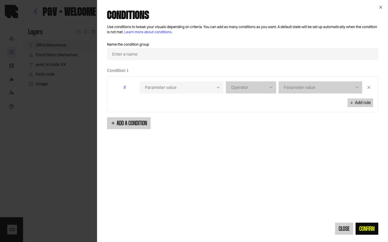
Overview
Conditions let you show or hide components based on data values at render time. Use conditions to create personalized templates that adapt to each user’s context — for example, showing a different image based on a product category or hiding a section when a field is empty.How Conditions Work
A condition is attached to a component or group in the layers tree. When the content is rendered:- The platform evaluates each condition against the resolved data.
- If a condition is met, the component is displayed in that condition’s state.
- If no condition is met, the default state is shown.
Condition Groups
A condition group is a named container for one or more condition rules on a component. Each rule defines a data-driven test (e.g., “product category equals Shoes”).Creating Conditions
1
Select a component or group
Click the component in the layers tree or on the canvas.
2
Add a condition
In the layers tree, right-click the component and select Add condition, or use the condition action in the configuration panel.
3
Configure the condition rule
Define the data test by selecting a datasource variable and a comparison operator.
4
Design each condition state
Switch between condition states using the dropdown in the layers tree. Customize the component’s appearance for each state.
Display None Option
You can toggle Display none if condition is false to completely hide the component when no condition is met, instead of showing a default state.Previewing Conditions
Use the condition state dropdown in the layers tree to preview each condition state on the canvas. The dropdown shows:- Condition 1, Condition 2, etc. — each named condition state.
- default — the fallback state.