Overview
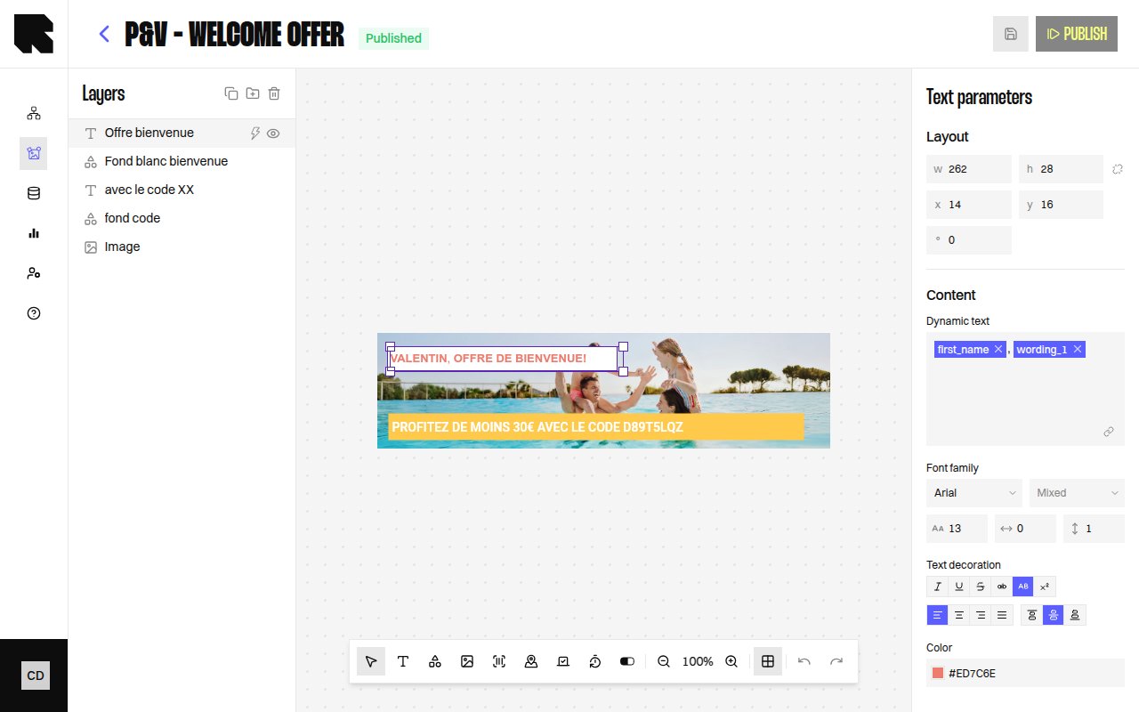
The Layers panel provides a hierarchical tree view of all components in your content template. It appears on the left side of the editor and lets you manage component ordering, grouping, and visibility.Layer Tree
Every component on the canvas appears as a node in the layers tree. The tree structure reflects the visual stacking order — components higher in the tree render on top.Tree Actions
| Action | Description |
|---|---|
| Expand / Collapse | Expand or collapse a group node to show or hide its children. |
| Show / Hide layer | Toggle a component’s visibility on the canvas. Hidden components are not rendered in the final output. |
| Drag and drop | Reorder components by dragging them up or down in the tree. |
Groups
Groups let you organize related components together. A group acts as a container in the layers tree.| Action | Description |
|---|---|
| Create group | Select one or more components and click Create group to wrap them in a new group. |
| Duplicate | Creates a copy of the selected component or group with the suffix “(Copy)”. |
Conditions in the Layer Tree
Components and groups can have conditions attached. When a condition is set, the tree shows:- A Condition badge on the node.
- An Add condition action to add more conditions.
- A dropdown to choose which condition state to preview on the canvas.
Selecting Layers
- Click a layer in the tree to select it on the canvas and open its configuration panel.
- Click a component on the canvas to highlight it in the layers tree.