Overview
The Text component lets you add rich text to your content templates. Text can be static or dynamic — bound to variables from datasources that resolve at render time.
| Property | Value |
|---|
| Toolbar button | Text |
| Supports data binding | Yes — text content, redirection link |
| Supports conditions | Yes |
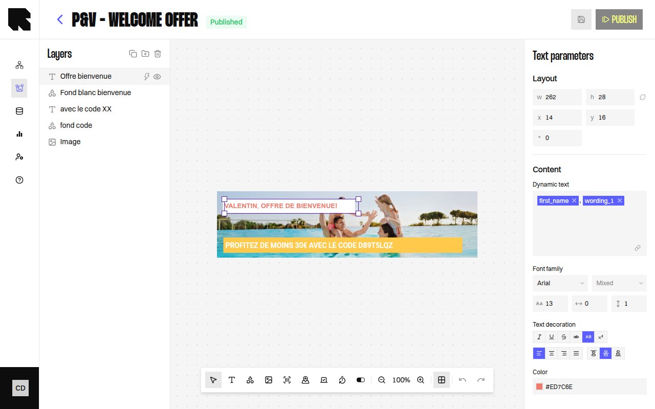
Text Parameters
When a Text component is selected, the configuration panel shows:
| Property | Description |
|---|
| Content | The text content. Type directly or use the rich text editor. |
| Dynamic text | Toggle to bind the text content to a datasource variable. |
Style
The text style section provides full typographic control:
| Property | Options |
|---|
| Font family | Select from available fonts (including custom fonts from Settings). |
| Font weight | Thin, Extra light, Light, Regular, Medium, Semi bold, Bold, Extra bold, Black, Extra black. |
| Size | Font size in pixels. |
| Letter spacing | Space between characters. |
| Line height | Vertical spacing between lines. |
| Color | Text fill color. |
| Text decoration | Uppercase, Lowercase, Underline, Crossed (strikethrough), Superscript, Italic. |
| Alignment | Left, Center, Right, Justify (horizontal). Top, Middle, Bottom (vertical). |
When text has mixed styles (e.g., part bold, part regular), the style fields show Mixed and apply changes only to the selected portion.
| Category | Examples |
|---|
| Date & time | Date, Date text, Hour, Day, Month’s name, etc. |
| Number | Round, Absolute, Negative, Percentage, Round up to N decimal. |
| Currency | Format with currency symbol, rounding options. |
Redirection
| Property | Description |
|---|
| Redirection link | URL users are redirected to on click. Can be a static URL or a datasource variable. |
If a content is used in a workflow that requires a redirection link, you must define one — otherwise publishing will show an error. 